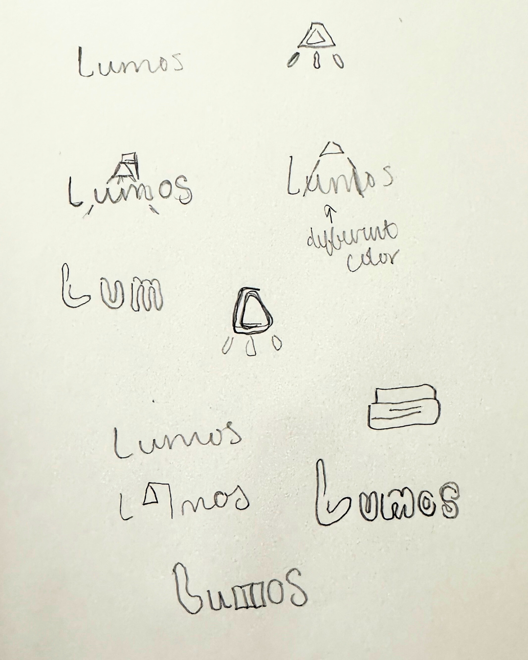
Case Study: Lumos Books
The prompt:
Design a logo and pattern for a bookstore with a neon theme.
The inspiration:
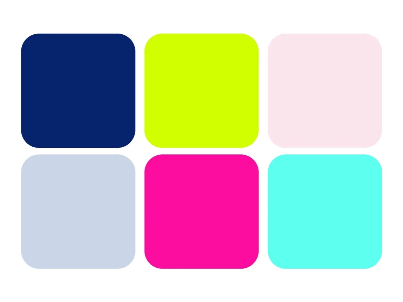
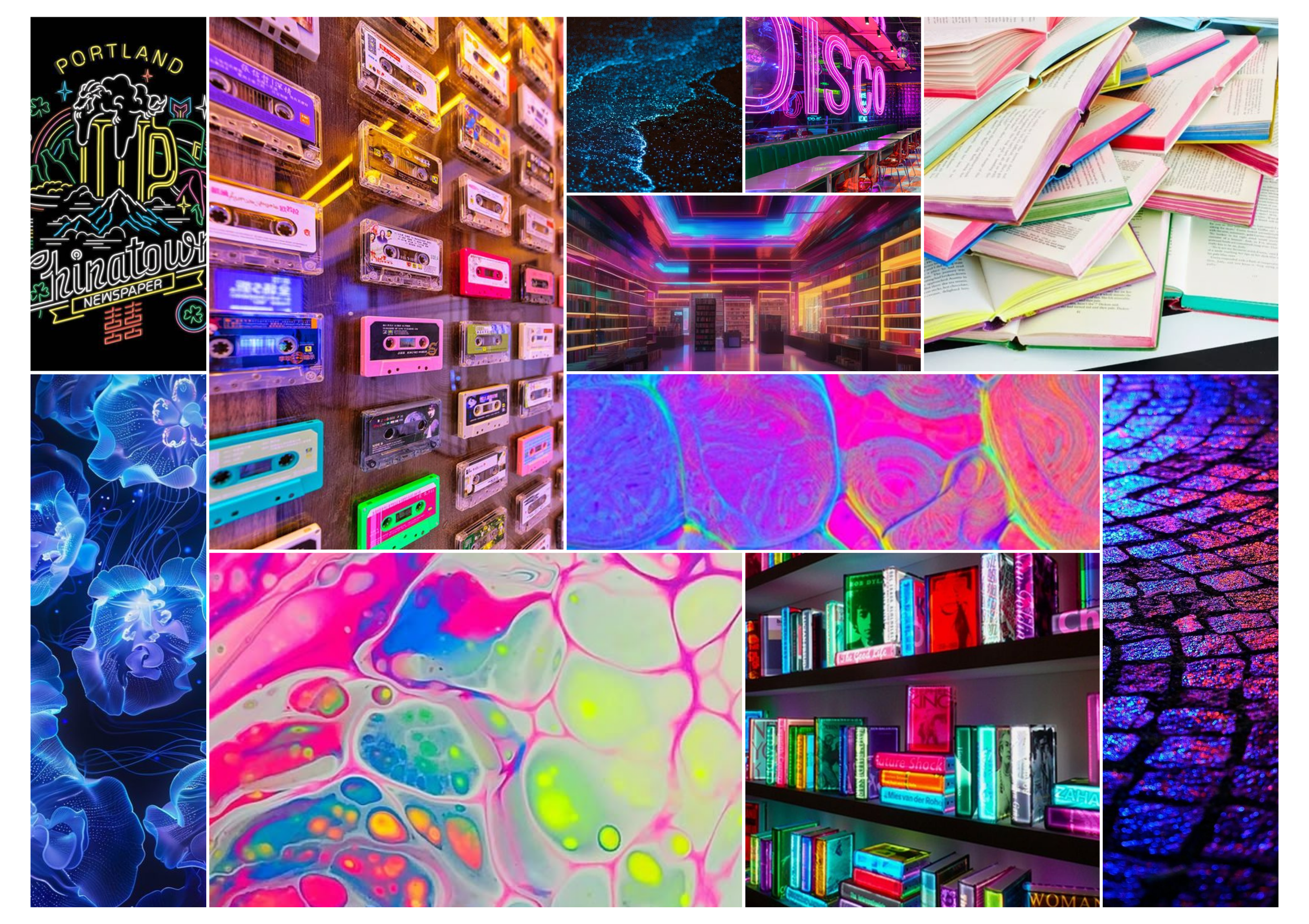
Pulling from the concept of bioluminescence for a vibrant neon color scheme, Lumos Books is a step back in time to neon signage and mixtapes where communities can come together to talk about books, read by lamp light, or shop for a new favorite novel.
The design problem:
Drawing inspiration from Saul Bass and his iconic movie posters I wanted Lumos Books to have a very graphic icon based brand identity. Being a space offering a service as well as physical products, I knew that this design would need to work in both digital spaces and physical applications like packaging and signage.
The brand values:
Lumos Books believes in creating a community around the art and media their loyal customers love. They understand and value the commodity of physical media and the feel of holding a book in your hands, flipping the pages, and smelling the paper. Lumos books is approachable and nostalgic with a hint of whimsy.
The audience:
Men and Women
Ages 25-50
College Educated
Working in corporate settings
Local to area but not born & raised
Quirky, fun, laid back, and social